Review: Scorn wraps a jaw-dropping world inside a frustrating game
The game design gets in the way of the art design in this gruesome adventure
- Game director
- Ljubomir Peklar
- Key Credits
- Mirko Bozovic (Producer), Lazar Mesaros (Art producer)

In a previous job, this writer had to attend a business conference that was being held at a function room at a zoo.
In between sessions, attendees were allowed to head out and walk around the zoo, but weren’t allowed to explore for too long because they kept having to go back to the conference.
We bring up this fairly specific anecdote because Scorn is the video game equivalent of it – a wondrous, exciting world whose exploration is constantly interrupted by something far less enjoyable.
Had Serbian developer Ebb Software not already confirmed that HR Giger was an influence on Scorn’s art design, we’d have been able to guess it with no hesitation.
Video games are no stranger to Giger’s work, either directly – he was involved in the Dark Seed point-and-click games of the ‘90s – or indirectly, given that his work on the Alien movies was naturally replicated in the numerous video game adaptations over the years.
But even though Giger shuffled off this mortal coil some eight years ago, we’d have had no problem believing it if someone had claimed his ghost had returned to design Scorn.
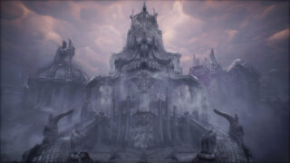
Put simply, Scorn has one of the most breathtakingly, ornately biomechanical worlds we’ve seen in a game, often feeling more like an Alien game than most Alien games do.
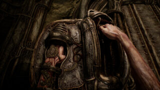
Every room, every corridor, every vast expanse is meticulously detailed with gorgeously grotesque, organic scenery. We can’t even describe what we’re seeing most of the time – all we know is it’s both disgusting and dazzling at once.
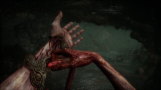
There are no switches in this game, no buttons, no keyholes. Only orifices. Lots of slots, holes and wound-like notches for you to jam your fingers, your hand, even someone else’s dismembered arm into, with the magnificent sound design accompanying this with a satisfyingly sickening squelch.
It’s a deeply atmospheric, artistically accomplished environment, then, and we’d be more than happy just being given free rein to explore it in detail. It’s just a shame the game gets in the way.
To put it bluntly, this incredible setting is host to a frustrating and inane adventure that’s part puzzle-solving, part combat, part aimlessly wandering around in frustration (which is the biggest part).
This is clearly one of those games whose central premise is that the player has been dropped into an unfamiliar world and has to figure out what to do. And on paper, other games like this have succeeded, going all the way back to the likes of Myst.
But the best examples of this are games that subtly and subconsciously guide the player through their journey, making them feel like they’ve done it all themselves when in reality they’ve been given the gentlest, feather-light nudges in the right direction throughout. That isn’t the case here.
Instead, most of Scorn is spent stumbling around, looking for parts of the scenery that might be interactive. Even when you find one, you can’t always interact with it – you’re often shunned with a tiny ‘no’ symbol and have to move on because apparently it’s not the right time to use that bit for some reason.
“Most of Scorn is spent stumbling around, looking for parts of the scenery that might be interactive.”
This would be annoying enough were it not for the fact that these beautiful environments aren’t really designed too well when it comes to determining which parts can be navigated. There are plenty of moments where you think “I could easily step up there, or slip through that gap” but the game decides that no, that particular squishy strip of flesh hanging from the ceiling now has the properties of a brick wall for some reason.
Eventually, through trial and error and a lot of swearing, you’ll reach the specific part of scenery the game wanted you to find and activate it. Sometimes it’ll lead to a puzzle (which is also typically lacking in any real signposting), other times it’ll just mean you have to move on to finding the next thing to activate.
This is particularly bad for players who suffer from motion sickness, as Scorn is that rarest of beasts in the modern world, a first-person game that doesn’t give players the option to put a small dot or crosshair in the middle of the screen.
This may not seem like an issue to some players, but others are susceptible to motion sickness if they play a first-person game with smooth scrolling but don’t have something in the middle of the screen for their brain to focus on: if you fit this description, you’ll need to drop the frame rate to 30 and maybe stick something on your screen to lessen the nausea.

This specific issue aside, the whole thing is so deeply disappointing, because in any other situation Scorn’s world should be held up in the highest of regards. Take out all the scavenger hunt bollocks and give us a VR version that just lets us explore each location and we’d be in heaven (and at least the motion sickness would be justified). Or, to return to our tenuous analogy, give us the zoo without forcing us to keep returning to the function room.
What Scorn does do surprisingly well, it should be noted, is run on Steam Deck. Despite seemingly being so advanced that the console version is only coming to Series X/S and not the last-gen Xbox One, the Steam Deck handles it perfectly well on Medium settings at 30fps and the moody environments still look wonderful. In fact, playing it on the Deck with the lights out and headphones on was our preferred option (until we got stuck again and had to remind ourselves not to launch it against the wall).
We fully appreciate that some players will be more tolerant of Scorn’s complete lack of signposting or even any subtle nods as to what to do. If you’re the sort of player who’s perfectly fine with with expectation that you’ll be doing a lot of backtracking and cluelessly studying lots of similar squishy things until you find the one that squishes in a different way, then feel free to add another point or two to the score.
Sadly, though, as much as we absolutely adored the clear attention to detail in Scorn’s environmental design, and as much as we legitimately think its Giger-esque world is a piece of (barely) interactive art, we were left deeply frustrated by the fact that we weren’t able to enjoy exploring it properly.
Scorn has one of the most beautiful worlds you'll see in a game (if you can see beauty in the grotesque). It's just a shame that world is also home to a frustrating puzzle-heavy adventure filled with aimless wandering.
- A legitimately stunning world with incredible art design
- Sound design to match: play it with headphones and you'll squirm
- Complete lack of signposting is hugely frustrating
- It's annoying navigating the world and trying to figure out which parts are inaccessible
- Lack of accessibility options gave us motion sickness


